

Clearway Speech Logo Design and Brand Roll-Out
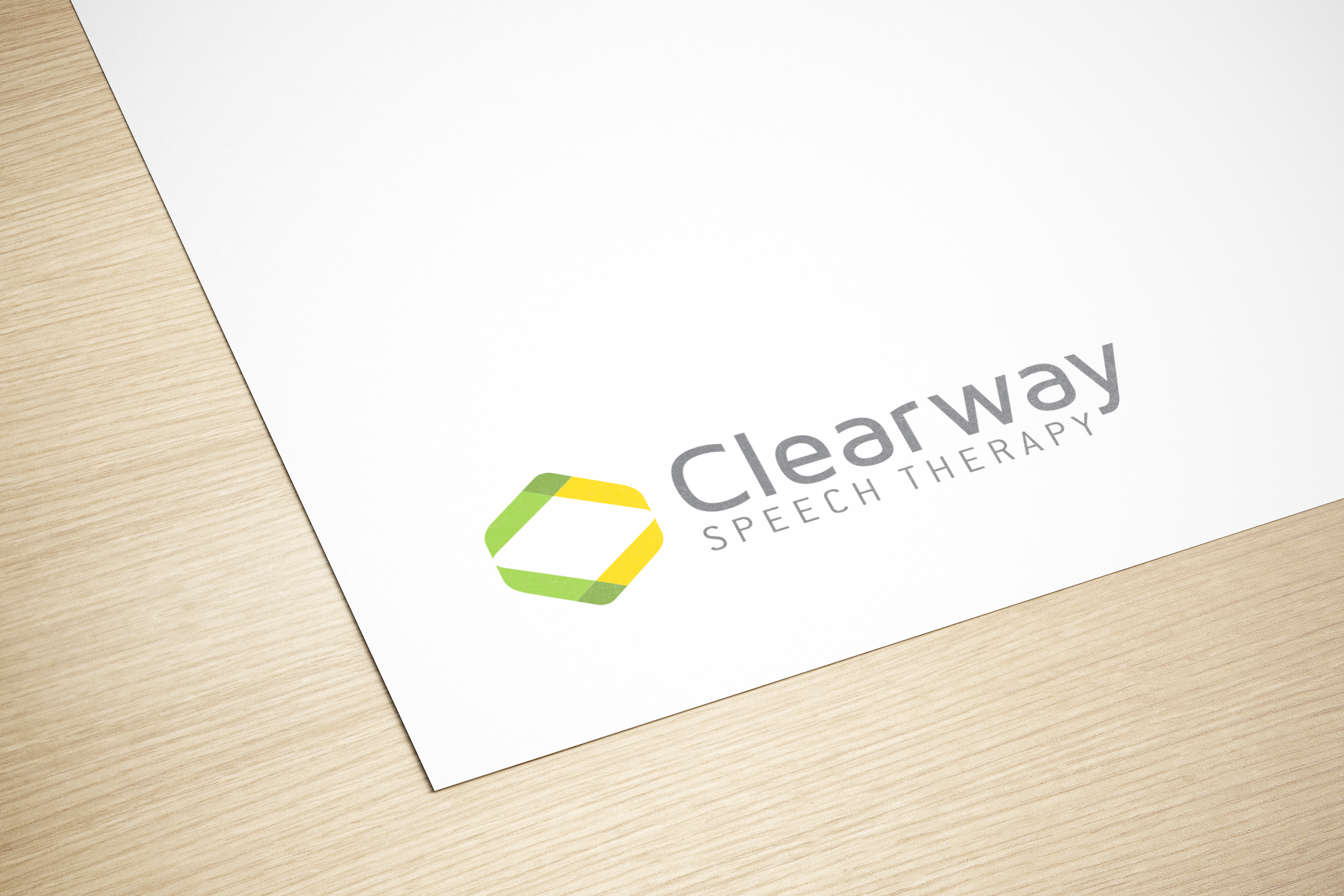
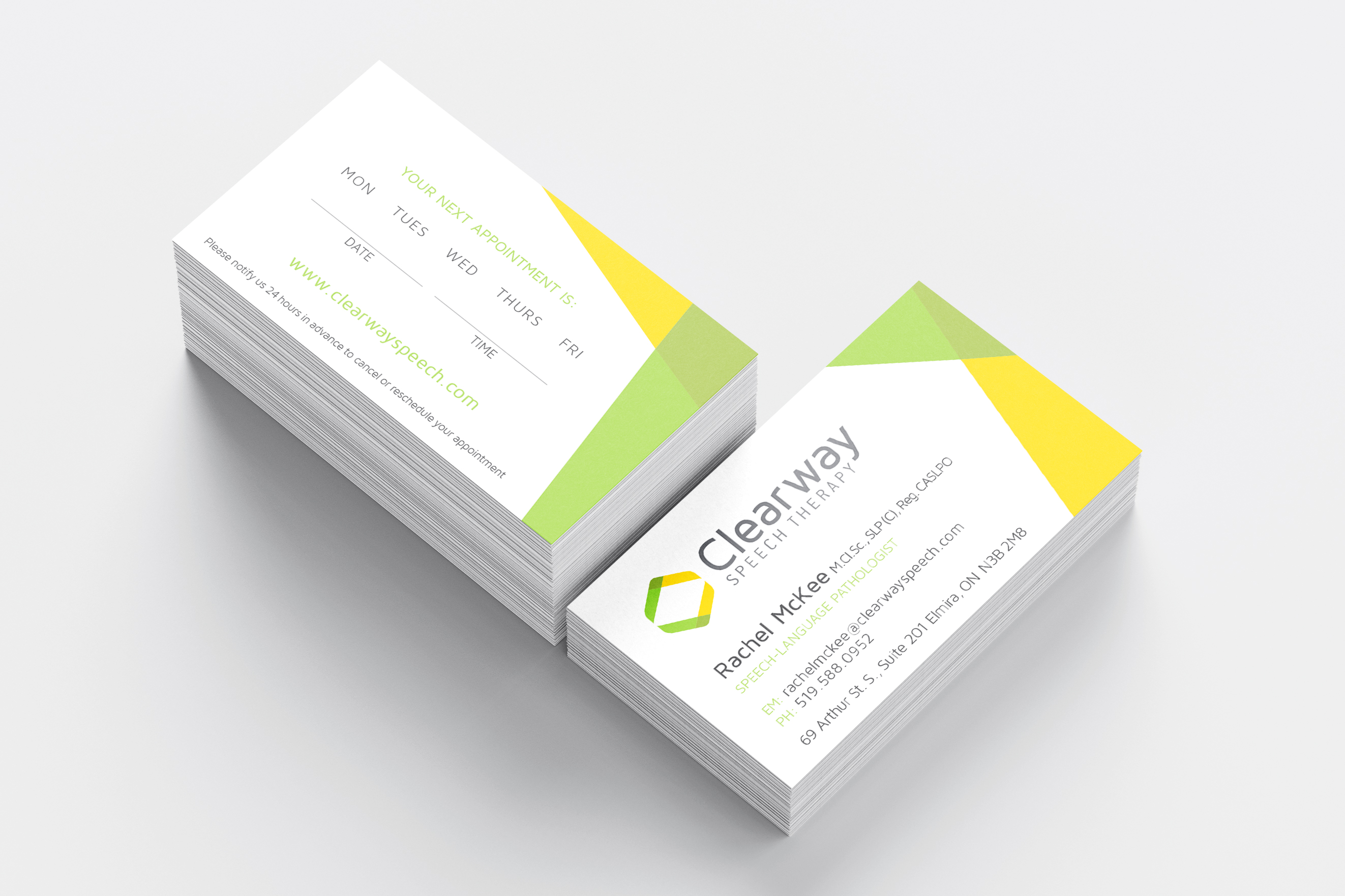
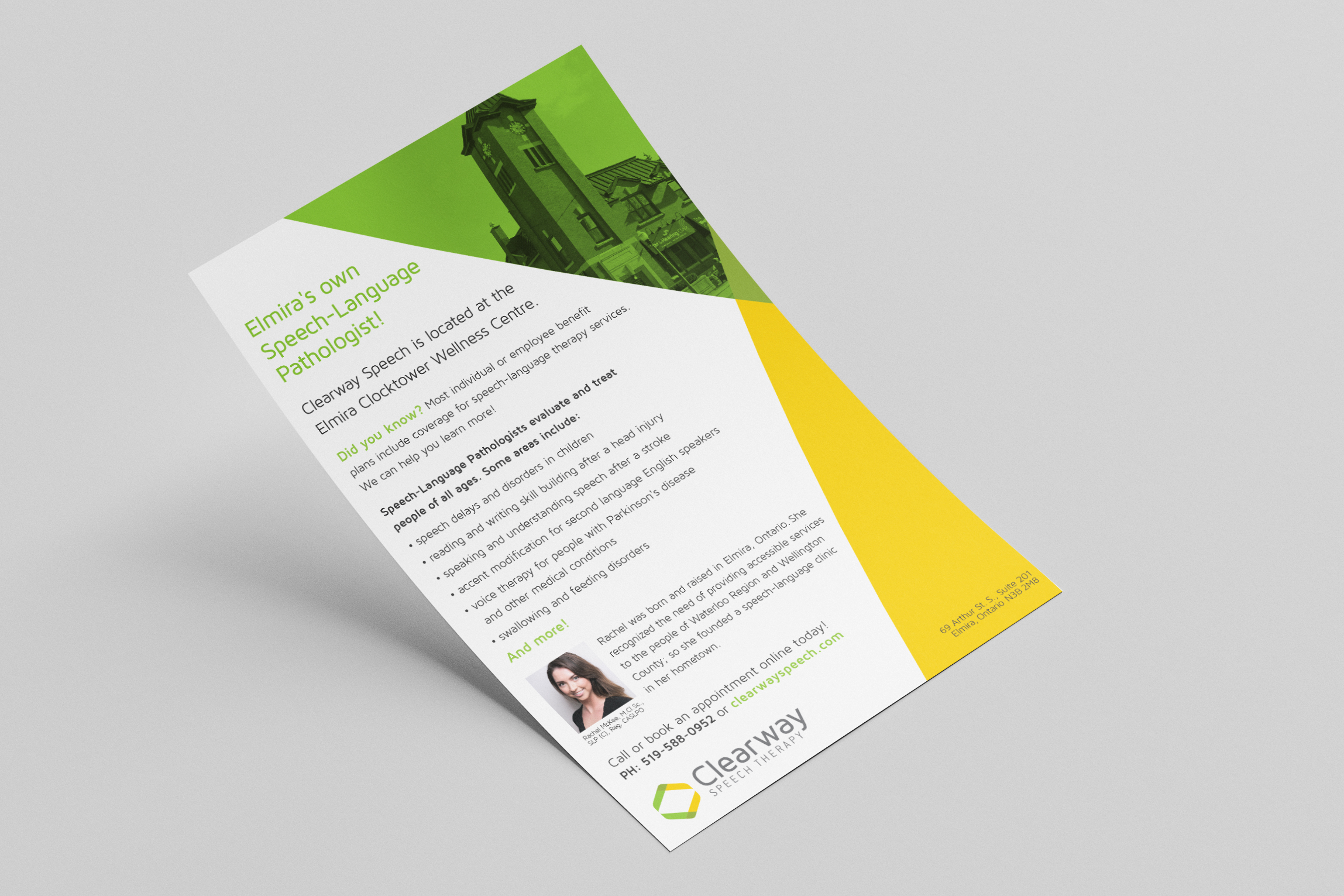
Clearway Speech requested a logo that showed connection, direction and also subtly showed a “clearway” through. Using two abstract ‘C’s turned horizontal with the yellow and green overlapping I was able to show connection, direction and by separating the ‘C’s I was able to give the client the ‘clearway’ path they were hoping for in their logo. I chose a font that was rounded and softer feeling to match the rounded edges in the icon. After the logo was created, I used elements from the logo to create look and feel for their company through a handout and business cards.
Client: Clearway Speech Therapy
Type of Project: Logo Development and Brand
